- Home
- Premium Memberships
- Lottery Results
- Forums
- Predictions
- Lottery Post Videos
- News
- Search Drawings
- Search Lottery Post
- Lottery Systems
- Lottery Charts
- Lottery Wheels
- Worldwide Jackpots
- Quick Picks
- On This Day in History
- Blogs
- Online Games
- Premium Features
- Contact Us
- Whitelist Lottery Post
- Rules
- Lottery Book Store
- Lottery Post Gift Shop

The time is now 8:06 am
You last visited
May 2, 2024, 7:51 am
All times shown are
Eastern Time (GMT-5:00)

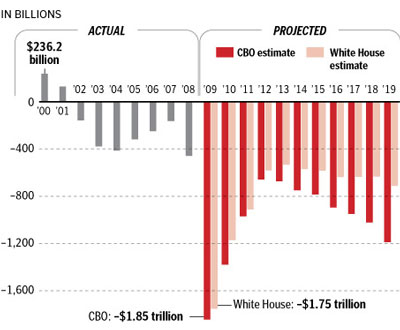
Graphs from the WAPO.
Published:
Updated:
From: http://blog.heritage.org/2009/03/24/bush-deficit-vs-obama-deficit-in-pictures/
Bush Obama

Bush Deficit vs. Obama Deficit in Pictures
Posted March 24th, 2009 at 10:20am in Ongoing Priorities with 377 comments Print This Post
UPDATE: This graph is now over one year old. For up to date information see this post: Budget 2011: Past Deficits vs. Obama's Deficits in Pictures
President Barack Obama has repeatedly claimed that his budget would cut the deficit by half by the end of his term. But as Heritage analyst Brian Riedl has pointed out, given that Obama has already helped quadruple the deficit with his stimulus package, pledging to halve it by 2013 is hardly ambitious. The Washington Post has a great graphic which helps put President Obama's budget deficits in context of President Bush's.
What's driving Obama's unprecedented massive deficits? Spending. Riedl details:
President Bush expanded the federal budget by a historic $700 billion through 2008. President Obama would add another $1 trillion. President Bush began a string of expensive financial bailouts. President Obama is accelerating that course.President Bush created a Medicare drug entitlement that will cost an estimated $800 billion in its first decade. President Obama has proposed a $634 billion down payment on a new government health care fund.President Bush increased federal education spending 58 percent faster than inflation. President Obama would double it.President Bush became the first President to spend 3 percent of GDP on federal antipoverty programs. President Obama has already increased this spending by 20 percent.President Bush tilted the income tax burden more toward upper-income taxpayers. President Obama would continue that trend.
President Bush presided over a $2.5 trillion increase in the public debt through 2008. Setting aside 2009 (for which Presidents Bush and Obama share responsibility for an additional $2.6 trillion in public debt), President Obama's budget would add $4.9 trillion in public debt from the beginning of 2010 through 2016.
UPDATE: Many Obama defenders in the comments are claiming that the numbers above do not include spending on Iraq and Afghanistan during the Bush years. They most certainly do. While Bush did fund the wars through emergency supplementals (not the regular budget process), that spending did not simply vanish. It is included in the numbers above. Also, some Obama defenders are claiming the graphic above represents biased Heritage Foundation numbers. While we stand behind the numbers we put out 100%, the numbers, and the graphic itself, above are from the Washington Post. We originally left out the link to WaPo. It has now been added.
CLARIFICATION: Of course, this Washington Post graphic does not perfectly delineate budget surpluses and deficits by administration. President Bush took office in January 2001, and therefore played a lead role in crafting the FY 2002-2008 budgets. Presidents Bush and Obama share responsibility for the FY 2009 budget deficit that overlaps their administrations, before President Obama assumes full budgetary responsibility beginning in FY 2010. Overall, President Obama's budget would add twice as much debt as President Bush over the same number of years.


Comments
"President Obama’s bailouts, massive stimulus spending, and other dangerous interventionist policies (some of which began in 2008) have made Americans less economically free. The 2010 Index of Economic Freedom analyzes just how economically “free†a country is, and this year America saw a steep and significant decline, enough to make it drop altogether from the “free†category, the first time this has happened in the 16 years we’ve been publishing these indexes. The United States dropped to “mostly free.†As the Index shows, lack of freedom has a direct, negative effect on job growth. It should be no surprise that President Obama’s policies have taken us down the path to fewer jobs and record deficits."
Post a Comment
Please Log In
To use this feature you must be logged into your Lottery Post account.
Not a member yet?
If you don't yet have a Lottery Post account, it's simple and free to create one! Just tap the Register button and after a quick process you'll be part of our lottery community.
Register