
- Home
- Premium Memberships
- Lottery Results
- Forums
- Predictions
- Lottery Post Videos
- News
- Search Drawings
- Search Lottery Post
- Lottery Systems
- Lottery Charts
- Lottery Wheels
- Worldwide Jackpots
- Quick Picks
- On This Day in History
- Blogs
- Online Games
- Premium Features
- Contact Us
- Whitelist Lottery Post
- Rules
- Lottery Book Store
- Lottery Post Gift Shop


The time is now 8:23 pm
You last visited
July 24, 2026, 10:22 am
All times shown are
Eastern Time (GMT-5:00)

Seeing is Knowing.
Published:
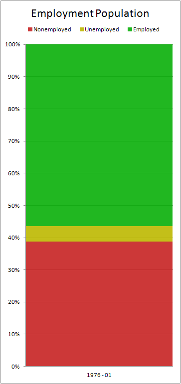
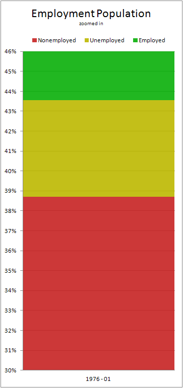
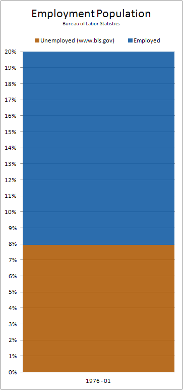
Below are some animated stacked bar charts of the Employment Population.
The bar charts to the left are the total population: Nonemployed, Unemployed, and Employed.
The bar chart to the right is the BLS (Bureau of Labor Statistics) one you hear about on the nightly news as reported by the likes of Brian Williams.
As you watch, you can see in years past before 2008, the left charts usually follow along with the right chart.
When it moves past 2008 we can see the the left two rise in Nonemployment and Unemployment but never go below 40%.
Also, the unemployment as reported by the BLS goes down giving the appearance of unemployment getting better.
Comments
A job'll come up, tomorrow.
Spend your last scraped up dollar,
Because, tomorrow, there'll be work.
...?!!
I can't remember the rest man. Here, you do it. I need another hit. hh-he-he-pff-pff.
Post a Comment
Please Log In
To use this feature you must be logged into your Lottery Post account.
Not a member yet?
If you don't yet have a Lottery Post account, it's simple and free to create one! Just tap the Register button and after a quick process you'll be part of our lottery community.
Register