


The Arizona Lottery announced the retirement of the logo last week, spokeswoman Karen Bach said.
In its place, the lottery's marketing agency, LaneTerralever, has designed a logo featuring a more contemporary style that conveys the "fun, entertaining nature of the brand," Bach said.
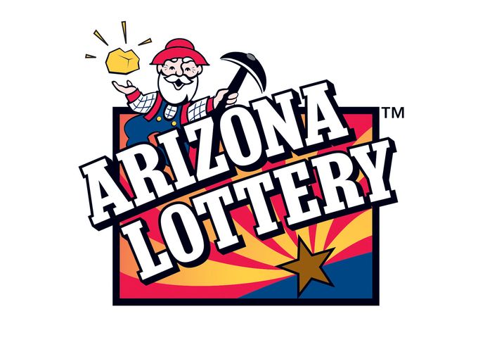
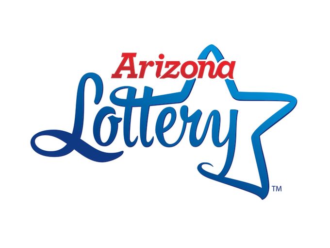
In place of a spry, bearded prospector kicking up his heels with a pick in one hand and a levitating piece of gold in the other, the Arizona Lottery has opted for a more adult-looking logo featuring cursive writing and the outline of a star, she said.
"The color palette is representative of the wide open skies and opportunities in Arizona, both the red and the blue colors give a nod back to the state flag as does our star graphic," Bach said.
The lottery chose the logo based on a year's worth of research talking with retailers, players and lottery staff to better understand who players are and why they are attracted to the brand, she said.
Willie won't be disappearing from lottery tickets in a hurry, however, as most are printed far in advance of their sale to the public, Bach said.
The rollout will begin with the website, electronic billboards and other digital elements. During the next few months, they'll switch out the print billboards, and during the next year, they'll begin to print games featuring the new logo, she said.
 (Click to display full-size in gallery)
 (Click to display full-size in gallery)
My vote is for the NEW Arizona logo. Congratulations to my neighboring State.
But the " old" logo could also convey to the people who have been playing for decades to " hang in there" after all old Codgers have been known to win as well.
Darn. Well, then, bye wistful, cute, nimble pick-axe carrying gold minor!
So now a lottery is in on it too, take away everything Americana and replace it with very plain no state pride images.
BOO!
Good job AZ Lottery
Good call. Miners shouldn't play the lottery.
Much better logo! Nice job
LOL Good play on words.
I like the old logo better. Marketing people always have to tinker w/ things.
I hope they leave the Jersey logo the same, it's an outline of the state w/ a 4 leaf clover on it.
oh i get it now, yeah that's a good one